Carried out between January 2015 and July 2015, our Fusion CCCP and RKEO Small Grant funded BU Datalabs project explored the possibilities and challenges associated with the communicative power of visual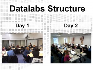 izations, maps and related interactive digital media for telling data stories on sensitive subjects of societal importance.
We use the term Data Storytelling to refer to the process of creating data-driven stories, from data collection all the way through to crafting the visual and contextual narratives that give data meaning(Greshon and Ward 2001).
Through a series innovative Datalabs events and workshops, we used a hands-on, participatory approach to teaching that combined principles of scaffolded technology learning and hacklabs (Hmelo-Silver et al., 2007). Activities included:
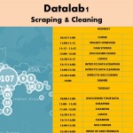
- Data Scraping & Cleaning – Monday March 16 and Tuesday March 17, 2015
- Data Visualisation with Mapping – Monday April 27 and Tuesday April 28, 2015
- Digital Storytelling with Data – Thursday May 14 and Friday May 15, 2015
- Mapping for Justice – 2 June 2015, w/ Richmond, American University in London
- Interdisciplinary Research Week: Turning Numbers into Narratives: An introduction to digital storytelling with data –14 May 2015, Talbot Campus, Bournemouth University
- Festival of Learning: Datastorytelling: How to Give Narrative to Numbers –13 July 2015, Talbot Campus, Bournemouth University
- Civic Forensics Design Workshop – 20 July 2015, Friends House, London
Prioritising collaborative exchange, we brought together researchers, students, journalists and NGOs to generate key insights and co-create tangible outputs. Partners included the Omega Research Foundation, who co-author reports with Amnesty International, and Minute Works, whose sustainable design roster includes Greenpeace. Together with our partners we co-created visualisation outputs including the Data Distortion Layer Cake, the Reclaim Brixton map, and the #RiotID civic forensics project. Partners also went on to put their new visualisation skills into action. Our partner IRIN, a humanitarian news agency, created infographics and maps, including this interactive map of migrant deaths.
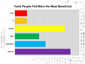 Feedback from our survey of Datalabs participants showed that most people’s familiarity with the tools and concepts taught during the workshops increased substantially, with most participants leaving the workshops feeling ‘familiar’ or ‘experienced’ with the basic tools and techniques of Data Storytelling.
Challenges and Opportunities
The emergent area of data storytelling provides both opportunities and challenges. Like any new digital skill, visualising data requires time and resources. This puts NGOs and small organisations at a disadvantage in terms of their ability to tell compelling data stories with visualisation. This disadvantage does not only manifest itself in the lack of resources to afford certain technologies, but also to afford know-how in the form of data visualization designers that are being “snatched up” by the corporate sector to work under Non-Disclosure Agreements (Wilson 2015).
In addition, while the rise of digital tools and techniques certainly diversifies the kinds of narratives we can tell with numbers, not all data stories are easy to capture. Sensitive subjects often have no straightforward data source, documents are scattered across agencies and organisations.
Our BU Datalabs project contributed to broader initiatives to bridge the emerging ‘big data divide’ that stands to leave the third sector and SMEs behind. Here at BU, we can help to narrow this divide by bringing together our skills and resources with stakeholder partners, to co-create visual resources and data stories for publi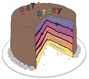 c engagement.
What’s Next?
Our BU Datalabs Report reflects on the key insights that arose out of this co-creation project. The aim of the final report is to show how other universities and organisations can use our model as a template, enabling their organisations to co-create data stories with public stakeholders. A preliminary version of the report was presented at the Data Power conference in Sheffield in June 2015. A further presentation is scheduled for November 2015 at the Media Education Summit in Boston, USA.
This year we are working to institute Datalabs activities and Data Storytelling education at BU through continuing collaborations between the Faculty of Media and Communication, the Data Science Institute, and the GIS Lab. We also continue to work with our partners as we prepare for larger bids.
Our next public Datalabs event is scheduled during the ESRC Festival of Social Science. This day long workshop on Datastorytelling will take you through the full process of creating a data story, from scraping and cleaning to crafting the narrative.
To find out more about the Datalabs project you can visit civicmedia.io or email: afeigenbaum@bournemouth.ac.uk or ethorsen@bournemouth.ac.uk
References
Gershon, N. and Ward P., 2001. ‘What Storytelling Can Do For Information Visualization’. Commun. ACM, 44 (8),pp.31-37.
Hmelo-Silver, C.E., Duncan, R.G. and Chinn, C.A., 2007. Scaffolding and Achievement in Problem-Based and Inquiry Learning: A Response to Kirschner, Sweller, and Clark (2006). Educational Psychologist, 42(2), pp.99-107.
Wilson, M., 2015. What Killed The Infographic? Fast Company, [blog] 6 May, Available at: <http://www.fastcodesign.com/3045291/what-killed-the-infographic> [Accessed 27 July 2015].
 Datalabs 3: Digital Storytelling with Data
 What do Wikileaks, MPs’ Expenses Scandals and Drone Strikes in Afghanistan have in common?


 ESRC Festival of Social Science 2026: An Opportunity to Engage New Audiences
 New HIV paper by BU PhD student
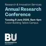 BU Annual Research Conference: Poster Exhibition Call for Applications
 Vitae Three Minute Thesis (3MT®) Competition: Applications Now Open
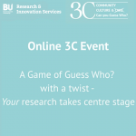 3C Online Social: Thursday 26 March 1–2pm – Research Culture, Community & Can you Guess Who?
 ECR Funding Open Call: Research Culture & Community Grant – Apply now
 ECR Funding Open Call: Research Culture & Community Grant – Application Deadline Friday 12 December
 MSCA Postdoctoral Fellowships 2025 Call
 ERC Advanced Grant 2025 Webinar
 Update on UKRO services
 European research project exploring use of ‘virtual twins’ to better manage metabolic associated fatty liver disease
One Response to “Where Numbers met Narratives: A Final Review of the BU Datalabs Fusion Project”