This spring semester, thanks to a Fusion CCCP grant, we’ll be turning our BU research into interactive media, designed for making an impact.
If you are like me, dishwashing, hanging laundry, answering emails and even updating your BRIAN profile are more fun than writing academic papers. Beyond the jargon, peer review terror and endless citations, there is something sad about paper writing. Like a farewell party for long-time friend, the paper is a bittersweet goodbye. It is when we send our research off, delivering its findings into the abyss of academic journals, hoping to eventually be discovered and read.
But increasingly, academic writing isn’t the only tool at our disposal for making our research heard. As the impact agenda expands, alongside it, interest in public engagement and social media grow. Unlike most academic journals, with strict limits on figures and black and white print, online platforms are hungry for colour and creativity. Online, image is king and curiosity brings clicks. If a picture was once worth 1,000 words, today a media interactive is worth 10,000.
With many online platforms freely available to visualise our data, making information beautiful has never been easier. So, why not make our own? That’s the question I asked myself last year. Rather than pulling out the drying rack or deleting the ‘pending’ neurological mice studies from BRIAN’s list, I decided to give google maps a go.
Mapping the Media
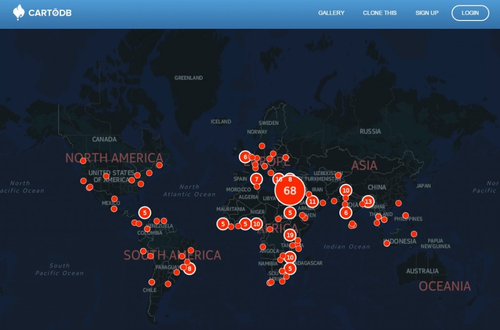
Bored of traditional content analysis in my field of Media Studies, and taken by the toys of Geographers, I began my very first research map. All it took was a google account, a google alert, and about five hours a month for data input. A year later, an interactive dataset was born.

With over 25,000 views and copied onto news articles and blogs around the world, this map tells a different story about my research and the world we live in, one that I could never capture in linear prose. It opens up new audiences to the data, and in an instant reveals insights into conflicts and communities–and the ways they are mediated. Click deeper and you’ve got a global sample of news coverage from around the world to explore as you wish, offering features no academic article alone could provide.
But, alas, it wasn’t very pretty. So I went in search of real map-makers. With the support of An AAG Enrichment Grant for interdisciplinary scholars, I presented my ragtag version at the American Association of Geographers in 2014, arriving with a plea for help. And as luck would have it, help sat in my audience. Matt Ellis, a geography student from Texas Christian University, came on board, teaching me about ‘coordinates’ and CVS files. Matt created a series of maps, designed and hosted for free at CartoDB. Making these media maps opened my eyes to the possibility of the ‘disciplinary mash-up.’ Digital technologies allow us take apart and reassemble our methodologies, sharing interdisciplinary work online to wide audiences.
From Google Maps to Fusion Grants
With a little imagination and a bit of collaboration, our research can be expressed in new and creative forms. What began as a temporary escape from the doldrums of peer review publishing, has turned into a new, cross-school research initiative here at BU. Supported by a Fusion CCCP Grant, between January and July 2015, myself, Nathan Farrell, Dan Jackson, Robert Munday, Shelley Thompson and Einar Thorsen from the Media School will be working with Hamid Bouchachia of the Data Science Institute, geographers Duncan Golicher and Phillipa Gillingham of the GIS lab, and Impact Manager Rebecca Edwards from RKEO to co-create a model for visualising research here at BU.
This project combines traditional approaches for understanding datasets in the social sciences and humanities with geospatial and artistic design practices. Working in co-production with our students, our project embraces digital techniques for orienting output toward public engagement. Bringing in international experts from the Tactical Technology Collective, the New Media Lab and Visualising Impact for a Masterclass in Visualising Data for Societal Impact, our Fusion project will connect up BU research with the growing fields of information design and data communications, putting BU’s innovations in digital humanities and digital social sciences on the academic map.
So next time you’re tired of writing, consider making a map. Or an infographic. A collage or a GIF. A comic strip or a meme. Don’t feel guilty for not writing that paper, take a break from typing and have a play.
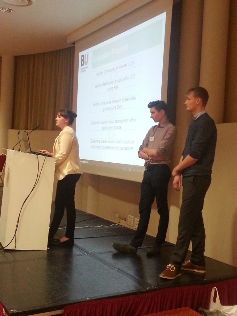 On 1st March we announced the launch of the next round of the Undergraduate Research Assistantship (URA) programme and opened the call for applications for positions to run in summer 2015 (see Launch of the summer round of the BU URA programme). The deadline is fast approaching (20th March) so you will need to get your applications in soon (apply here).









 New academic paper on Nepal
 3C Event: Research Culture, Community & Cherry Blossom
 Boost Your Research Profile: Training Sessions with The Conversation
 ESRC Festival of Social Science 2026: An Opportunity to Engage New Audiences
 New HIV paper by BU PhD student
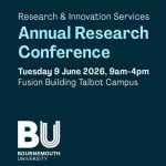 BU Annual Research Conference: Poster Exhibition Call for Applications
 ECR Funding Open Call: Research Culture & Community Grant – Apply now
 ECR Funding Open Call: Research Culture & Community Grant – Application Deadline Friday 12 December
 MSCA Postdoctoral Fellowships 2025 Call
 ERC Advanced Grant 2025 Webinar
 Update on UKRO services
 European research project exploring use of ‘virtual twins’ to better manage metabolic associated fatty liver disease