Welcome back!
The following funding opportunities have been announced. Please follow the links for more information. 
EPSRC
Pilot call: Access to the Research Data Facility (RDF) for UK researchers
EPSRC have recognised the need to store active computational data and to be able to use this data for further scientific benefit, so are looking at giving access to storage on the national Research Data Facility (RDF).
This call is for applicants within the remit of RCUK but performing research outside of the remit of EPSRC and NERC. The total amount of storage available for this pilot call is 1000TB.
deadline dates:
Technical assessment : 29th January
Closing date: 12th February
Marine Renewable Energy KE Fellow call
NERC invites proposals for a Knowledge Exchange Fellowship in the area of marine renewable energy. NERC is seeking to invest in a suitably qualified academic to broker links between the academics and businesses within the UK marine renewable energy community, as well as with relevant regulators and policymakers.
Applicants should outline their own approach to a programme of work in the marine renewable energy sector. Further guidance on this opportunity is at the foot of this page along with instructions on how to submit the application via Je-S.
deadline dates:
17 March 2016 at 16:00
Philip Leverhulme Prizes
Philip Leverhulme Prizes recognise the achievement of outstanding researchers whose work has already attracted international recognition and whose future career is exceptionally promising. This call is repeated once a year.
deadline dates:
16 May 2016 at 16:00
Artist in Residence Grants
These awards support the residency of an individual artist in a UK university or museum in order to foster a creative collaboration between the artist and the staff and/or students of that institution. The term ‘artist’ encompasses visual artists, creative writers, musicians, poets and other producers of original creative work.
The scheme brings an artist into a research and study environment where their artistic form or creative art is not part of the normal curriculum or activities of the host department. There must be a distinct contrast between the artist and host department’s expertise (for example, a poet being hosted by a physics department, a composer by a geography department). It is not the objective of the residency to provide additional teaching capacity for the host department. An artist may not apply directly – all applications must be made by the host institution.
Applications open on 8 April 2016. The closing date is 4pm on 8 September 2016
Joint Call of the JPI Urban Europe, supported by the European Commission
JPI Urban Europe’s fourth call – the ERA-NET Cofund Smart Urban Futures (ENSUF) – supported by the European Commission under the Horizon 2020 programme, is open.
Three call topics are defined:
- Concepts and strategies for smart urban transformation, growth and shrinkage
- New dynamics of public services
- Inclusive, vibrant and accessible urban communities
deadline date (pre-proposals):
15 March 2016 at 12:00 Central European Time
If you are interested in submitting to any of the above calls you must contact RKEO with adequate notice before the deadline.
Please note that some funding bodies specify a time for submission as well as a date. Please confirm this with your RKEO Funding Development Officer
You can set up your own personalised alerts on Research Professional. If you need help setting these up, just ask your School’s/Faculty’s Funding Development Officer in RKEO or view the recent blog post here.
If thinking of applying, why not add notification of your interest on Research Professional’s record of the bid so that BU colleagues can see your intention to bid and contact you to collaborate.
![InnovateUK_LogoA_Interim_RGBx320govuk[1]](http://blogs.bournemouth.ac.uk/research/files/2014/12/InnovateUK_LogoA_Interim_RGBx320govuk11-300x90.jpg) European Funding for the Creative Industries.
European Funding for the Creative Industries.









 ESRC Festival of Social Science 2026: An Opportunity to Engage New Audiences
 New HIV paper by BU PhD student
 BU Annual Research Conference: Poster Exhibition Call for Applications
 Vitae Three Minute Thesis (3MT®) Competition: Applications Now Open
 3C Online Social: Thursday 26 March 1–2pm – Research Culture, Community & Can you Guess Who?
 ECR Funding Open Call: Research Culture & Community Grant – Apply now
 ECR Funding Open Call: Research Culture & Community Grant – Application Deadline Friday 12 December
 MSCA Postdoctoral Fellowships 2025 Call
 ERC Advanced Grant 2025 Webinar
 Update on UKRO services
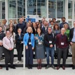 European research project exploring use of ‘virtual twins’ to better manage metabolic associated fatty liver disease